Two dates. Two taps.
A vacation range did not need separate From and Until interactions before the calendar could do its job.
To set time away, I had to open From, choose a date, open Until, and choose another date. The calendar already contained both dates. I wanted to tap the beginning and the end directly.
The request was concrete enough to become a small interaction contract: tap 15, tap 24, and the range is selected. The rest of the flow could then explain the consequences.
See the original requestInside the screen
The range is the main task.
Start and end belong together. Extra precision can wait until the person asks for it.
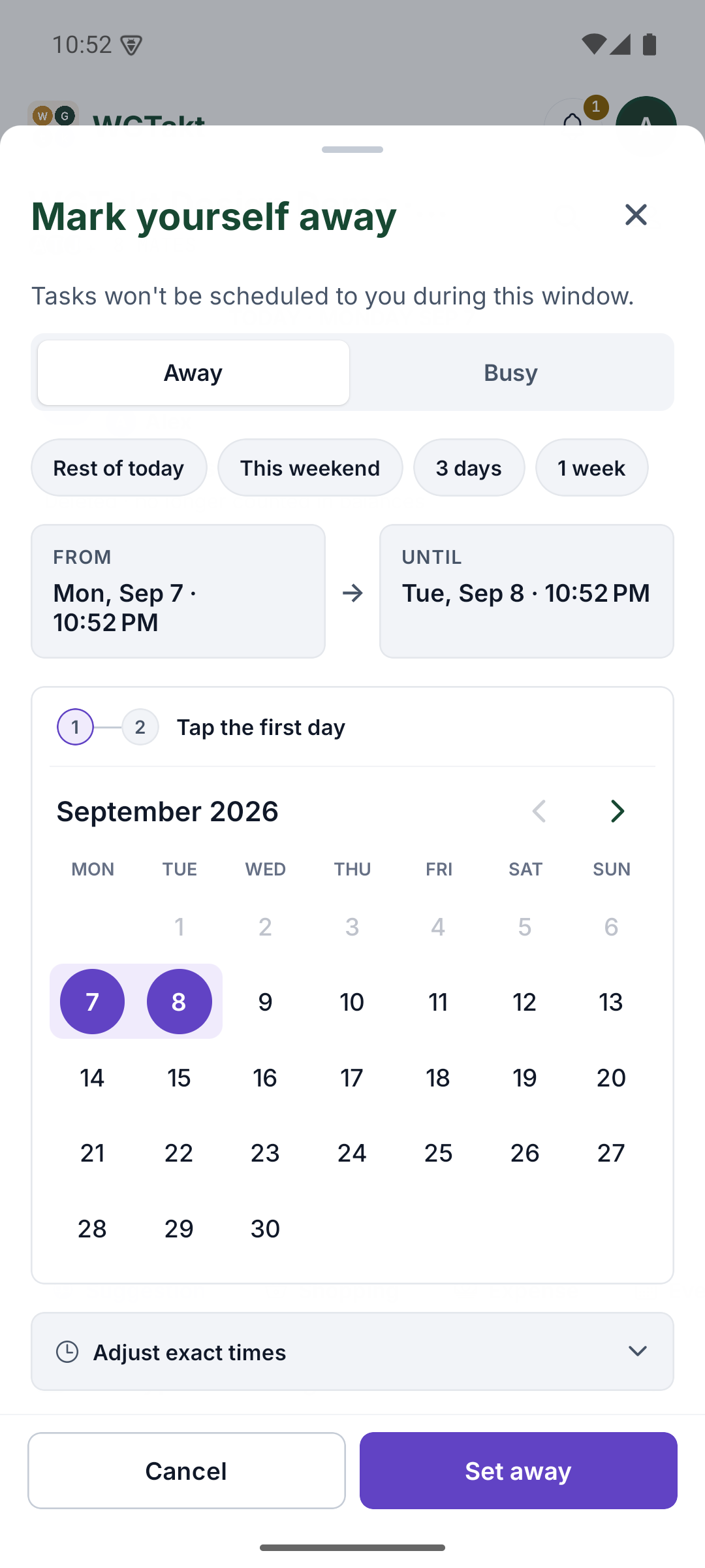
Select a detail
From and Until make the current range readable above the calendar. I would check that the first and second taps update the correct endpoint.
The highlighted dates connect the summary to the calendar. The next test is interaction: change the start, reverse the order, and choose across a month boundary.
The exact time controls are collapsed. That keeps a simple absence from becoming a form full of time fields before they are needed.
Actual Android capture from September. The selected dates are a development example, not someone’s travel plans.
The original request15 Jul 2026 · excerpt
would be cool if you click on the calendar for example click 15 and then 24 and its done, its two clicks instead of 4
Excerpted from the development conversation. Punctuation is lightly edited; the surrounding story is an edited retrospective.
01
The summary should confirm what my finger already did.
The original interaction made From and Until into separate doors to the same calendar. My request removed that detour. Once the calendar owns the range, those labels can become a useful summary: this is the start, this is the end. The highlight between them gives a second way to check the selection before saving.
The later Android capture makes the relationship visible. Two dates are connected in the month view, and the summaries remain above it. The exact time controls are still available below. That separation matters because a quick vacation entry and a precise partial day absence are different needs. I wanted the common action to become faster without removing the detail required by the less common one.
02
Hide precision until it is useful
Exact times were collapsed by default for vacations, with short three day and one week presets available. The common action could stay quick while the detailed controls remained accessible.
A preset still needs a visible resulting range. Convenience should not leave someone guessing which dates were selected. The highlighted calendar and the summaries help make the result inspectable.
03
Fewer taps did not mean fewer consequences.
Time away changes who can receive work. That means the range picker sits inside a larger household decision, with rescue effects, late notice, edits, and cancellation. The implementation retained those parts while changing how the dates were entered. Otherwise the interface could become pleasantly fast at making a change people did not understand.
The interaction I would test is deliberately ordinary: choose the first date, choose the last, inspect the range, adjust a time if needed, and read the effect before saving. I would also change my mind halfway through and edit an existing absence. The July response reported the implementation live on both mobile platforms. The September screenshot is later native evidence of the calendar surface, and its date stays visible beside it.
A selected date still needs a clear commitment boundary. I return to that question in A reservation rule has to survive the final click.
Where this chapter landed
What changed.
Direct range selection, range summaries, collapsed time controls, and short presets were implemented and reported live on both mobile platforms.
Added while revisiting this story · September 2026
The thinking behind the detail.
Research notes to take these decisions further. These sources were reviewed for this retrospective.
Make the range a meaningful group
W3C recommends grouping related controls visually and in code. The start and end of an absence form one decision. Their shared context should survive both the visual layout and assistive navigation.